

 We are keeping with our summer series of more charts and fewer words. Most of this newsletter will be discussing interest rates, inflation and why many fear the eventual monetary stimulus unwind.
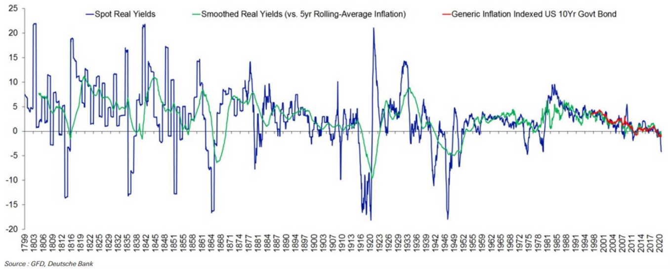
The chart above attempts to rebuild a history of U.S. interest rates over the span of the country’s independence. Two items stick out to us from the chart. The first is the low levels of interest rate volatility since the U.S. went off the gold standard. It begs the questions, has the U.S. Federal Reserve mastered the financial engineering of our economy so that past episodes of rate volatility will not repeat? Or are we becoming complacent in future rate movements?
 The second item is real interest rates (meaning the yield one can obtain from owning a U.S. 10-year bond minus the inflation currently being experienced) have gone negative and hit a level not seen since 1980 with the chart below offering the more recent history.
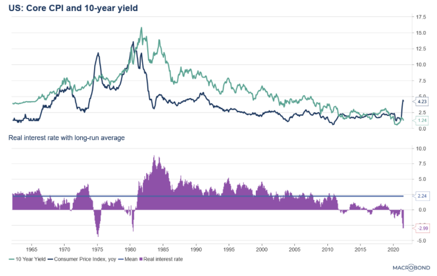
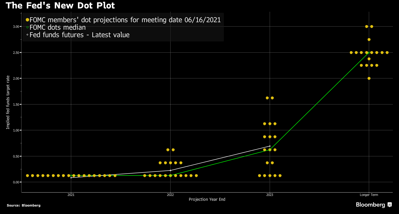
Negative real rates have been short-lived throughout history which suggests something needs to change. Either inflation subsides or rates move up. Or a combination of the two. The Federal Reserve governors have recently been communicating a desire to return to a higher and more normal interest rate environment. We fully admit there is a difference between wishes and reality, but the increasing level of communications suggest the stimulative environment may be nearing its end. The dot plot above shows their expectations for future rates through 2023 and beyond.
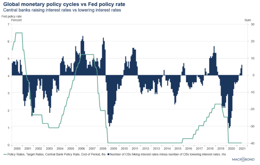 This upward bias in central bank policy rates is not just a U.S. phenomenon. The number of interest rate rises around the global has been picking up after years of monetary easing as illustrated in the chart below.
 There is ample concern within the financial community regarding investing in a rising interest rate environment. And those concerns will only grow if inflation becomes sticky while central banks walk slowly away from low interest rates. The result would be negative real interest rate lasting longer. This is unwelcomed as negative real interest rates are a form of money destruction. For every year inflation grows faster than the risk-free growth of your savings, you will experience a reduction in future purchasing power.
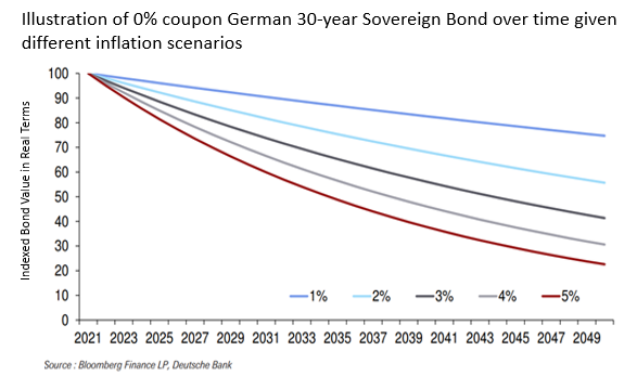
To illustrate the concern, the chart above shows the impact of higher inflation on low-earning government bonds. The chart demonstrates the real value of a long-term government bond (using a German 30-year bond as an extreme example) over the holding period. With a 3% long-term inflation rate, the bond’s value is cut in half over the 30 years. Investors have benefitted the past 35 years from ever lower interest rates and inflation allowing bond values to appreciate. That is likely coming to an end.
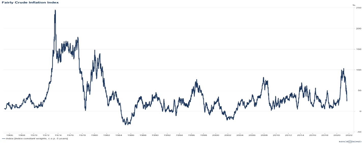 This conversation is very much dependent on the stickiness of inflation and central banks’ need to react to it. We are still in a wait-and-see mode when it comes to inflation, but we have modified our Very Crude Inflation Index to include labor costs. The VCII focused on prices of goods (e.g., trade, food, and shelter). The new version (humbly named the Fairly Crude Inflation Index or FCII for short) builds in the change of wages. In a services-dominant economy such as the U.S., the cost of labor will play a role on the durability of the currently high inflation readings.
We are firm believers that inflation can not become a runaway issue until wage growth anticipates inflation rather than reacts to it. At this point, the combination of our measures does not suggest that runaway inflation is a near-term threat. However, as the previous chart shows, even in a low inflation environment, bonds exhibit a negative return profile.
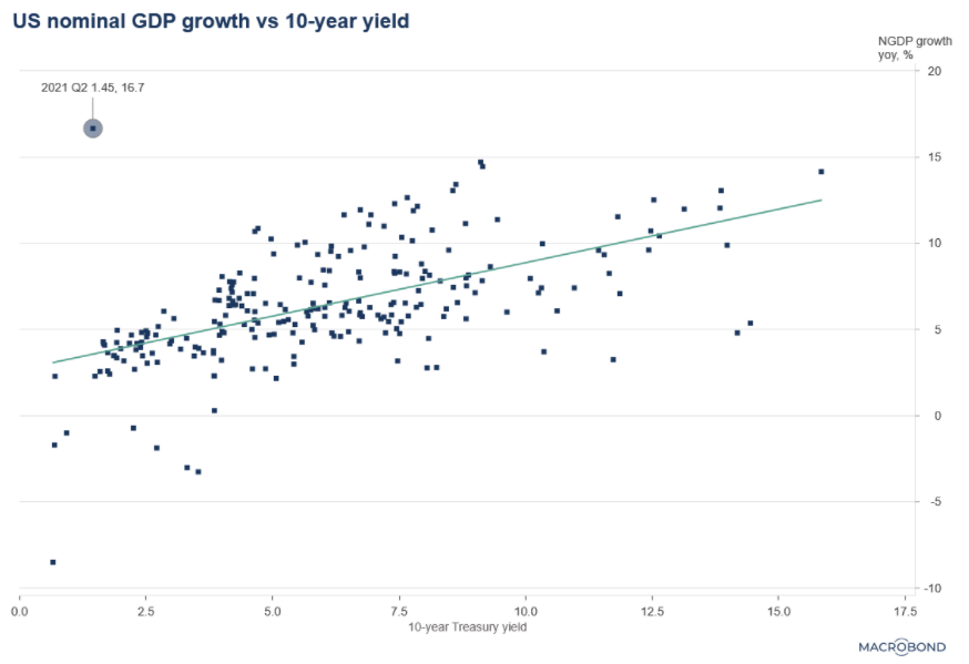 Inflation is an important factor when thinking of the appropriate government interest rate. But it is not the only factor. We want to highlight the chart below which shows the historical association of economic growth and interest rates and where we currently sit within history. The title of this newsletter came to us as we built this graph. We see this as an unstable equilibrium where markets are calm, but the current setting is not likely to withstand a shock.
Lastly, since 2019, our portfolios have favored large, U.S. equities, represented by the S&P 500 index, while limiting our exposure to international equities. Though our cash position has prevented us from fully participating in the current risk-on environment, our favoring of S&P 500 companies over international companies has benefited our clients. Specifically, the S&P 500 has risen 54% over the past 2 years compared to the U.K. equity index (as one example) losing 1% over that same time. Many factors have driven the disparity of returns such as underlying earnings growth and quality of companies. However, the polling results below may suggest other items are contributing to U.S. market optimism.
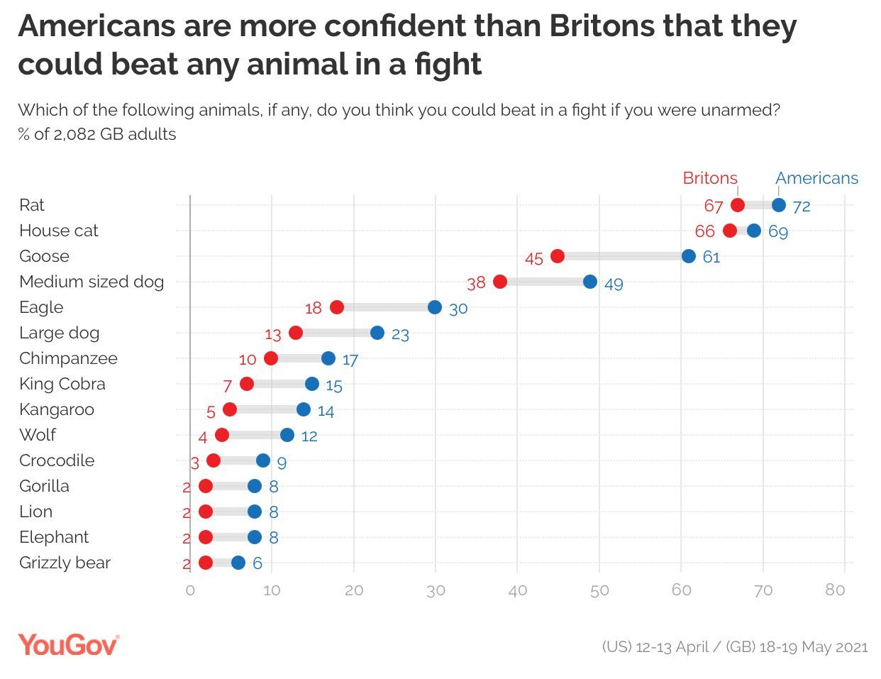
If you think you could take on a kangaroo and win, maybe you are willing to buy into stretched equity valuations and a tenuous bond market. Our money is on the kangaroo…